Happy Lunar New Year
Happy Lunar New Year! May you find Year of the Rabbit brings you hop(e) and inner peace.
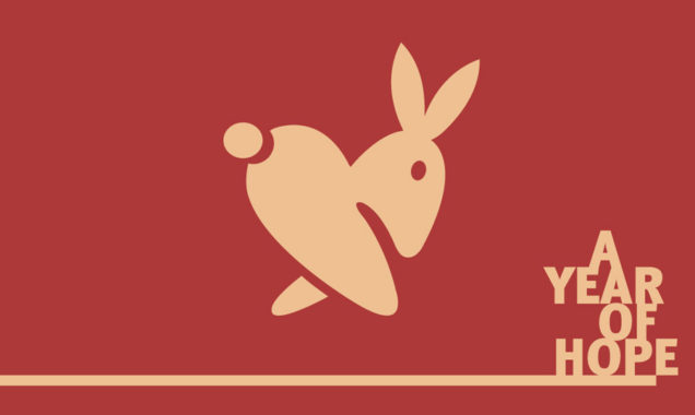
Happy Lunar New Year! May you find Year of the Rabbit brings you hop(e) and inner peace.
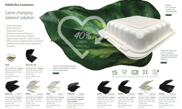
Beautiful product catalogue creation. How to display takeout containers in a compelling visual way. So proud to have the opportunity to tell an evolving story of Ecopax’s brand and its line of innovative products that are matching market demands. It is so wonderful to see this company moving from manufacturing classic single-use containers to producing innovative source reduction products over the years.
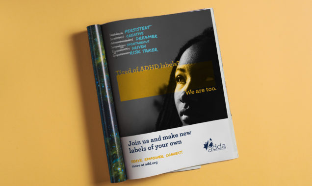
A simple powerful magazine ad created for Attention Deficit Disorder Association (ADDA). The focus of the design is to empower people who are dealing with ADHD to take action, access resources and learn how to thrive by being part of the ADDA community.
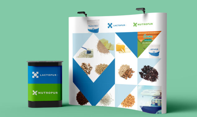
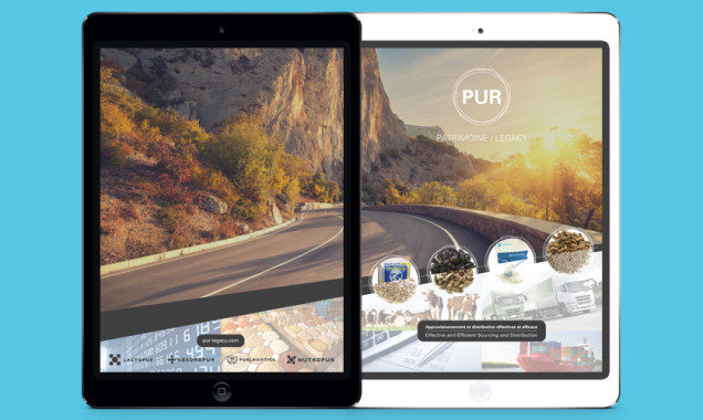
We were tasked to create a unison trade show booth display for Lactopur and its sister company Nutropur, for their spot at Gulfood, the world’s largest annual food and beverage trade exhibition in the Middle East. Lactopur and Nutropur are trading companies for commodities such as dairy products and spices. The goal was to create an eye-catching backdrop that showcases all their products and logistical trading methods while keeping the overall design dynamic with product images thoughtfully placed.
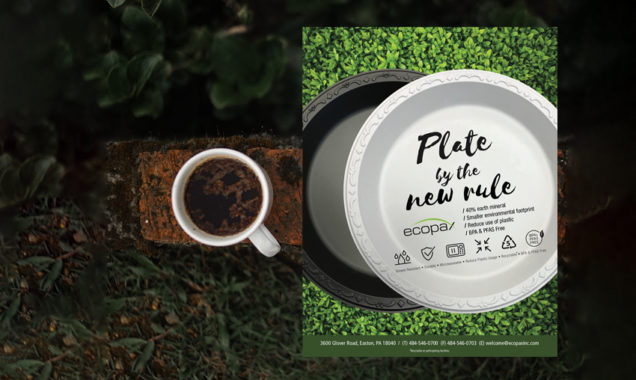
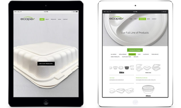
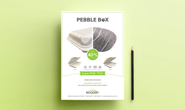
Ecopax Inc. is a manufacturer of a wide variety of food and beverages takeout containers. One of the things that make us so proud of our client, Ecopax, is their continuous commitment to invest in product innovation aimed to reduce environmental footprint. Their new recyclable BPA & PFAS free Pebble Plate products are not only durable and microwaveable, they are made of 40% earth minerals. Less usage of plastic, happier the planet! The results of these thoughtfully produced products are a real game changer in the single-use disposable plate and container market.
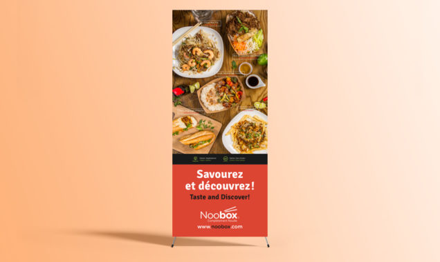
Banner ads require great attention to details to get it right. With that in mind, we created an eye-catching and savory food focused banner for Noobox restaurants. From our participation to the photoshoot to the creation of a punchy tagline, our goal was to make sure passersby will say “We want to try it”.
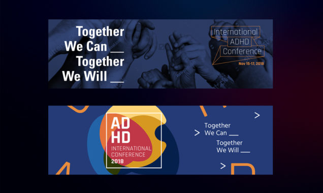
Kai Design was tasked by three organizations – ADDA, CHADD and ADHD Coaches Organization (ACO), to create branding concepts for their first joint International Conference on ADHD. We presented three design ideas that reflect the theme of the conference: “Together we can…Together we will”.
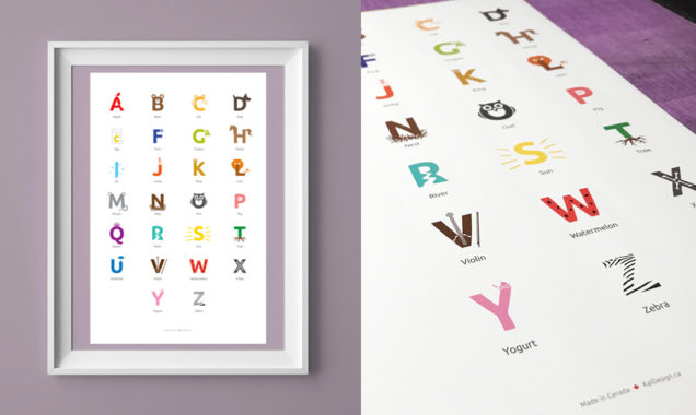
Our art director, I-Kai Chen, always had a hard time finding an alphabet poster that is cute enough for the kids to enjoy and stylish enough for their parents to display it on the wall. Hence, the concept of a designer A to Z poster was born! The goal of the design task was to enhance the traditional A to Z poster concept while adding a clever and modern graphic design touch that not only allow the content to stay educational, but also visually appealing.
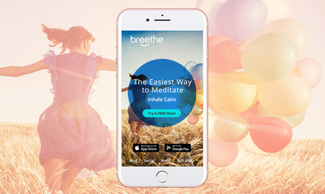
KAI Design’s director, I-Kai Chen, practices yoga and is on the path to explore meditation. What a coincidence when Breethe, a meditation app based in Montreal, reached out.
Breethe app makes meditating easy for everyday people with busy lives, busy minds and limited time. Formally known as OMG, I Can Meditate, Breethe was in need of a rebranding and we were thrilled to work with them! We provided them art and creative direction as well as suggesting a brand guide which includes a new landing page design, a new look for its social media and a new eNewsletter layout design.
With its new modern, zen, unclutttered and serene image, it’s now obvious Breethe is the easiest way to meditate and we gladly made that message comes alive. KAI Design is in full zen phase!
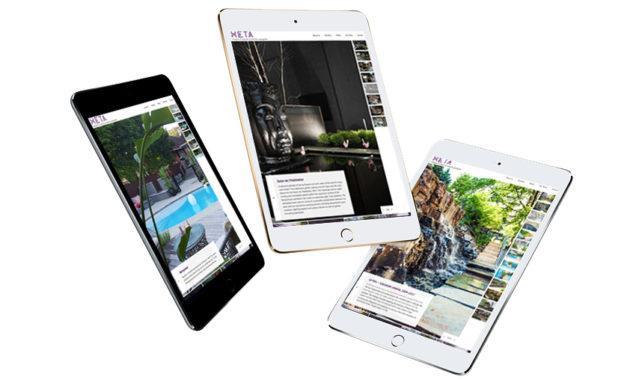
Hodgins & Associés architectes paysagistes embarks on its 30th anniversary journey with a rebranding initiative and a complete facelift for their website.
Their reputation for building high quality and sensuous landscapes with an emphasis on collaboration, innovation and ageless design has to be presented in a new modern way. Kai Design’s task is to reflects Hodgins & Associés’ value and its positioning in the market space.
Kai Design has been tasked to redesign the website for Ecopax Inc. — an agile single-use takeout containers manufacturer based in U.S. Our art direction is focused on displaying Ecopax’s wide range of products as well as communicating its quality and commitment for sustainable solutions. The creative concept represents Ecopax “Less is More” value with a whimsical touch. We are very proud to include this project in our #VeryKaiDesign portfolio.
Kai Design was tasked with creating the visual components of HETA’s 30th anniversary celebration. The concept we developed – “You Are In It” – evolved from the idea that this architecture firm’s clients are an integral part of its success story. This theme helped set the tonality of HETA’s new brand elements, as well as its communication approach when it comes to presenting itself in both the public and the clients’ eyes.
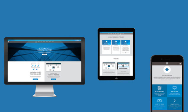
Over 220 emails were involved in launching VMRay’s brand new website. This has been one of our most ambitious web projects yet, designed with longevity and functionality in mind – all the while delivering a site content that is well thought out and carefully organized, frontend and backend!
To mark the launch of Ecopax’s latest green product for single-use takeout containers, we came up with a visually striking imagery to go with its promotional materials. We were able to shine a spotlight on the company’s new Pebble Box, an eco-friendly solution made with 40% earth mineral, resulting in a smaller environmental footprint.
In order to develop a branding concept for an organization comprised of four distinct divisions, we wanted to come up with a theme that would overlap all its business activities. Our client? The Montreal-based Pur group, consisting of Absorbpur, a distributor of environmental products, Lactopur, a dairy trading specialist, PurLogistics, a freight moving company, and Nutropur, a food commodities trader.
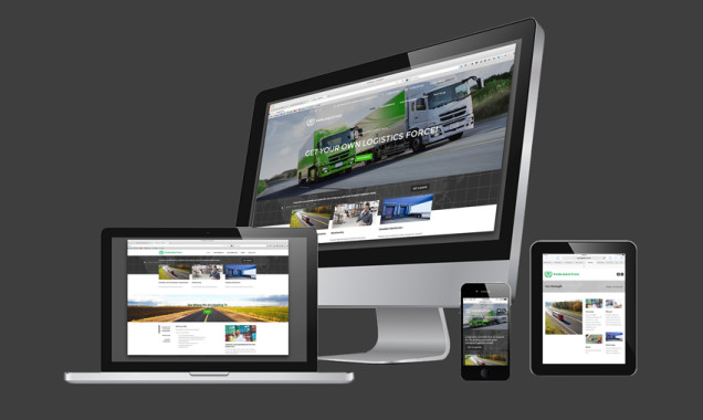
For a Montreal-based company moving freight across North America, Kai Design created an effective website – one that is on-brand and was completed both on-time and on-budget!
Fully customized to meet PurLogistics’ needs and help it serve its clients, this bilingual website was built using a WordPress theme designed to be responsive and work with desktop computers, tablets and smartphones.
Our proposal for 20th Anniversary Ad design for Commonwealth Independent States Navigation!
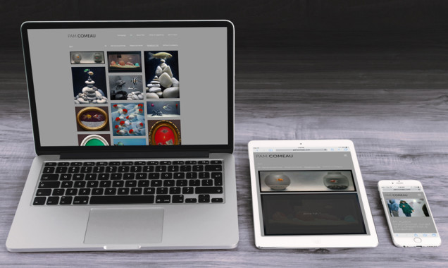
A mindful and yet dynamic website creation for Pam Comeau, an award winning hyper-realist artist based in Montreal. Pam’s website was created by customizing a premium WordPress theme with art and creative directions supported by Kai Design.
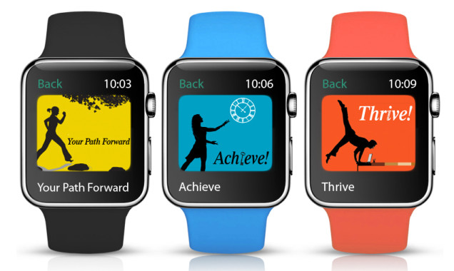
Linda Walker, a specialized ADHD coach, offers three distinct coaching programs. Kai Design’s mandate was to create branded looks that are consistent with the essence of these programs as well as adding design flare and whimsical touch to the images.
Power of Smile! The secret weapon of customer service! From Kai Design’s eNewsletter – eepurl.com/bjH_of. Why not share your signature smile?
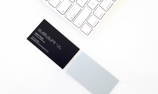
A recently quick-service design project had our client gushing with praises! The mandate of the project was to design a business card that is simple, elegant and timeless. Printed on metallic grey pearl cardstock, the sleek minimalist design reflects client’s profession – tiling artist. Jymmy Forest’s business cards are available at Montreal’s fine Ciot locations.
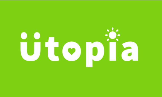
Design your own utopia! In a perfect world, what would your utopia be like? http://eepurl.com/bgeY69
Does your website or brochure need to be translated from English to French for the Quebec market?
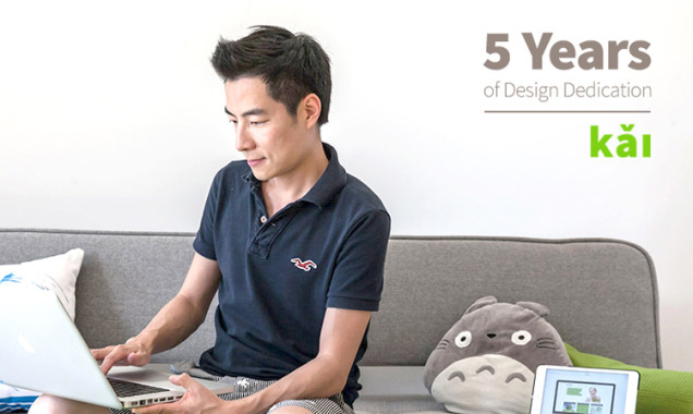
Kai Design has recently celebrated its five-year milestone in business. We have worked with 117 clients, realized over 300 marketing projects and we have been involved with over 40 events held in our studio.
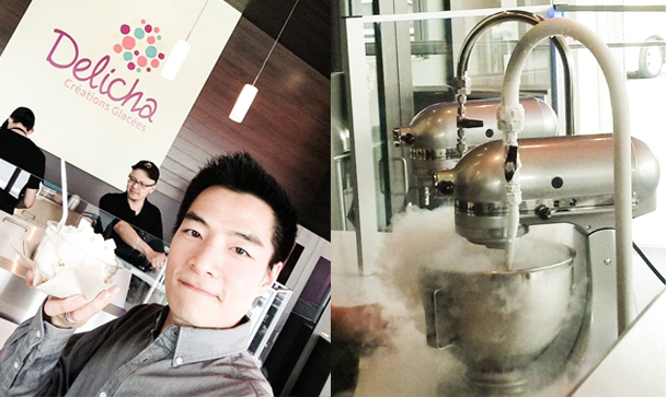
Put this on your #MustEat list before the summer is over! One of our latest clients – Delicha – opened the first liquid nitrogen ice cream bar in the province. Nothing beats seeing your own ice cream creation made-to-order just for you come to live right in front of your eyes! Science + Food = #FunFood. Did we also mention the generous portion of their ice cream? ☺ You’ve got to try it out! Delicha Montreal location is located at 908 Saint-Urbain right near Place d’Armes metro in downtow
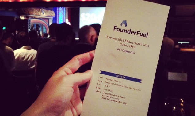
Inspired! Amazed! Motivated! That’s how we feel everytime we attend the Founderfuel Demo Day. For the past years, we have been there, listening and watching new startups pitching their business to investors. This year, KAI Design has been honored to provide its graphic design service to give the Demo Day pamphlet a new facelift.
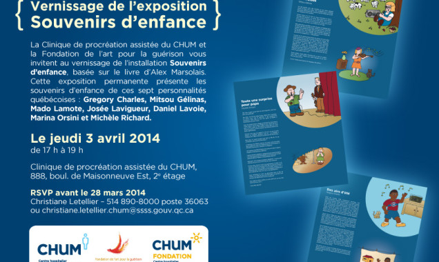
Kai Design created poster design displays that feature childhood memories of seven famous Quebec personalities to go on the walls of Clinique de procréation assistée du CHUM. The framed displays bring joy, hope and a positive message to the clinic. The project is a collaboration with Art for Healing Foundation and Souvenirs d’enfance book author, Alex Marsolais.
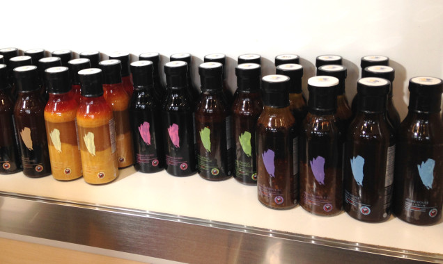
Visited the booth of one of our favorite clients, Noobox, at EXPO Manger Santé et Vivre Vert. The Noobox team was there to promote their latest products: Asian flavored sauces! It was pretty amazing to see how they win the crowds over with these new products. And of course, we are proud to see those beautiful and colorful sauce labels we designed being displayed on the shelf!
We got our hands on creating an urban, hipster-cool logo for Montreal-based bagel sandwich store Hinnawi Bros Bagel et Café. Check it out, and drop by the restaurant to taste one of their delicious sandwiches!